Nina's Textile Trail 2

– Textiles 1: Mixed Media for Textiles


9 Comments

Assignment 5 – A Final Piece – Stage 3 Sample making – Artists’ Books

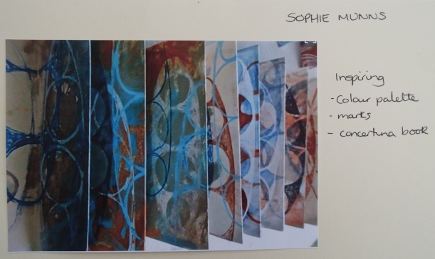
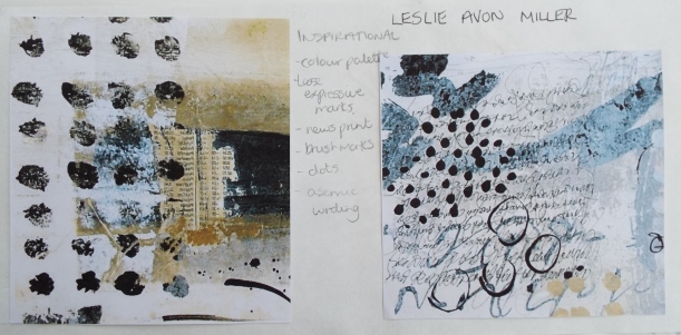
To determine how to present my prints as a finished sample, the artists researched in this assignment were revisited.  My initial thoughts were to assemble a collage on a canvas or make an artist’s book.  However, once I revisited the artists whose work I’d admired, I quickly went off the idea of a canvas.  It seemed a bit two dimensional, perhaps dated and a three dimensional book was more tempting.  I had admired Ann Symes’s book art, Sophie Munns’ accordian books and Leslie Avon Miller’s small journals, so I looked for a few more examples, some of which are included below.

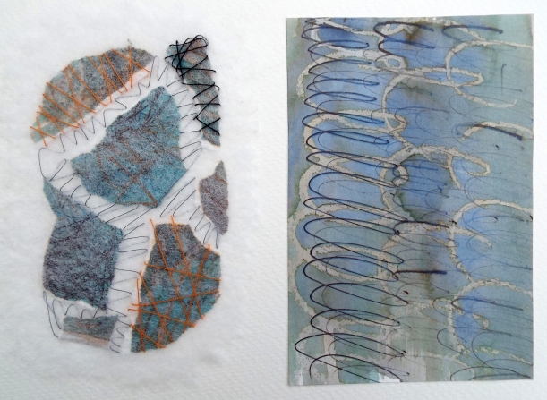
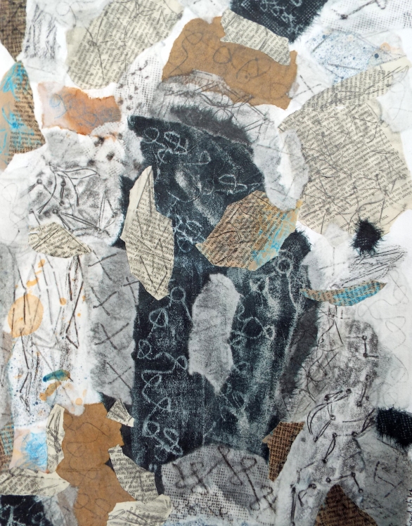
Thinking about the painted papers and collaged prints on tissue, I was also inspired by Linda Welch’s book art.

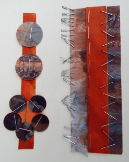
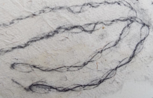
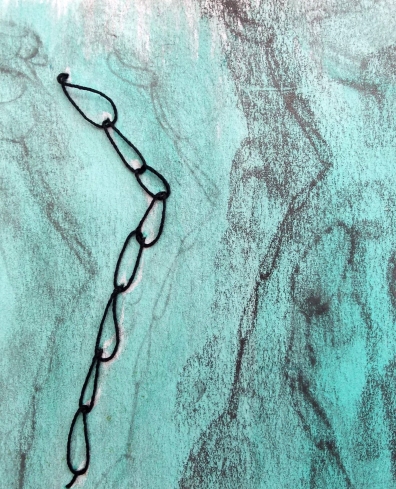
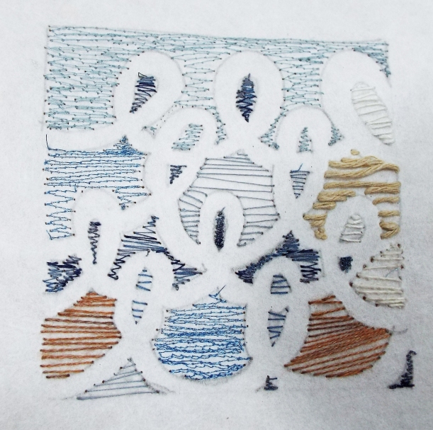
I had struggled to find examples of print from stitch and was delighted when an OCA peer recommended Annwyn Dean to me.  She is an embroiderer, printmaker and book artist.  I was interested to note that the “iconography” used in her design “evolves from the embroidery fragments that were made in India in the C18th for the export market” and was fascinated to see the lovely shapes and designs she has produced as a book artist.

I recall my inability to get excited with pleating in Assignment 1 and now see it holds much potential and very much look forward to exploring book forms in the future.

Referring to Alisa Golden’s book, Making Handmade books, some samples were made using papers from my ‘stash’, starting with the simpler folding techniques.

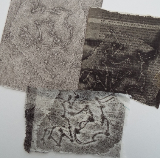
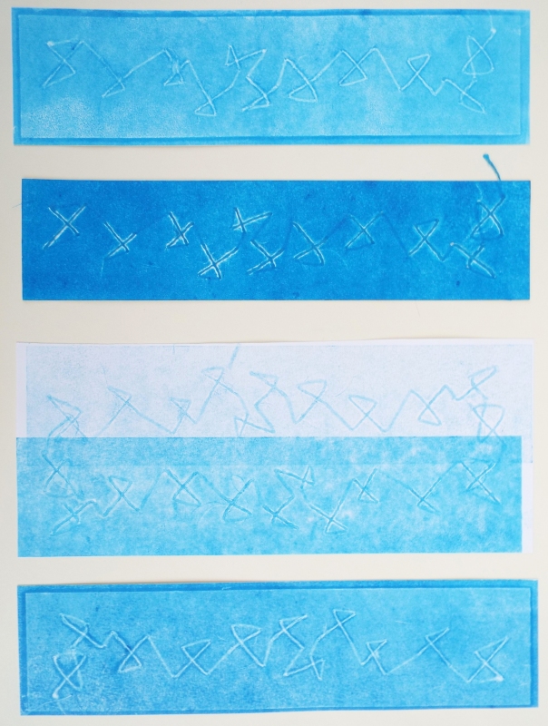
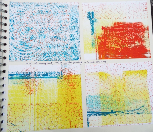
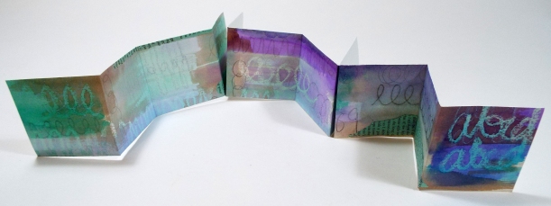
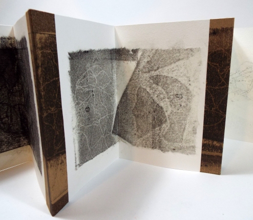
The following is ‘XBook’, made from a single sheet of A4 printed on one side which had been used to test/clean the roller whilst printing.

dscf6319dscf6318

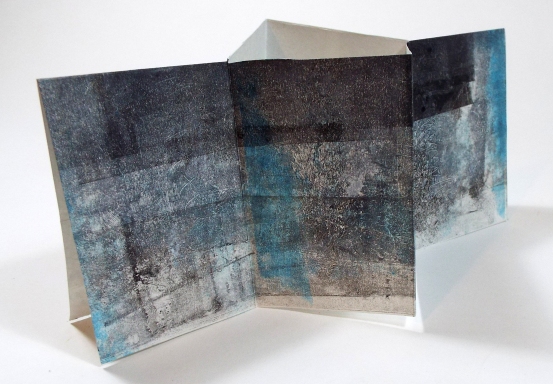
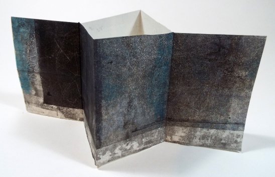
I was surprised and encouraged by how pleasing the structure was, it stood reasonably well, although one edge of the paper was deckled, a learning point for next time to cut all edges smoothly.  It was easy to to stand and would display prints or collaged papers well.

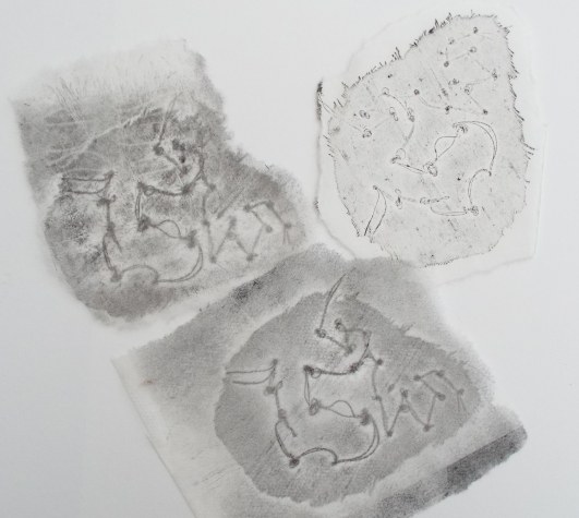
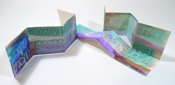
Moving on, I made ‘Pants Book/Simple Accordion’, again with a single sheet of A4 and similar sized pages to the above.

This too was quite a surprise, I could see it working, although had a slight preference for the XBook which less fussy and easier to stand.

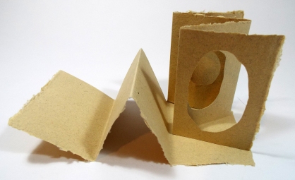
Next was a Pants Book/Simple Accordion with Tunnel, made with a single sheet of khadi paper,  I was looking forward to this as I like the texture of hand made paper and was interested in the idea of the windows created by the ‘tunnel’.  I was disappointed.  It just did not have the appeal of the crisp finishes and sharp folds of the first two books.  It may have improved had it not been a plain sheet but I could not imagine it adding any value to my prints.

dscf6327

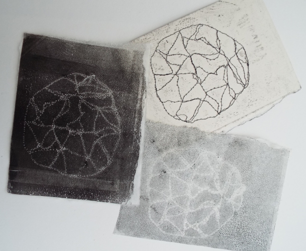
A ‘Snake Book’, also from a single sheet of A4 but with more folds, so additional, but smaller, pages:

dscf6324dscf6325

This too was disappointing, it was difficult to display easily and didn’t stand as well as hoped.

The  finished ‘Guest Book’ below measures approximately 8.5 x 5.5 cm and was made from a sheet of A4.

This was quite pleasing, nice to hold and showed none of the blank side of the page.  It’s a lightweight cartridge paper with glued folded pages but not as neat or cleanly made as some of the others. I might make this style of book again as a gift for a friend or to display painted papers, but think neatly cut single layers of paper with the grain all in one direction is more suited to my purpose now.

The ‘Concertina with Tabs’ below was quite exciting, definitely competing with the favourite two so far.  One appealing characteristic was the fact that it was made with individual pages, in this case 14 x 21.5 cm, which were then joined with the tabs which would be more practical when printing.

dscf6336dscf6337dscf6335

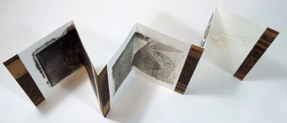
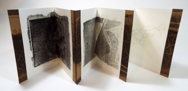
A5 watercolour paper was used which gave it a quality feel and takes the tissue prints well, melting into the surface when adhered with Golden Soft Gel (matte).  The printed brown paper made a contrasting tab, with the similar texture of the black brayered ink unifying the prints and tabs.

A ‘Flag Book’ was constructed next.  Here I learned that the flags are better made from card or heavy weight paper, the top and bottom rows were painted 140gsm paper which was a little ‘floppy’ whereas the middle row was a heavy, maybe 220gsm, watercolour paper.  I like the design, it has impact as it is opened, but I think the printed design would need to be planned with the tabs in mind as it could be a bit busy.

Having found the diamond shape in the XBook appealing, I decided to make a ‘Back to Back Accordion Book’, to which I added hard covers.  It was made with good quality cartridge paper and stands well.  There is something simple and clean about the design, it is interesting but I can imagine the sharp folds and geometic shapes offsetting the soft prints well.

So this is my favourite so far, with the concertina in second place.

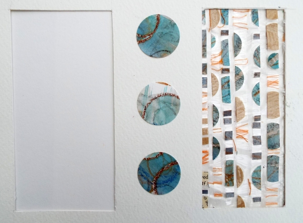
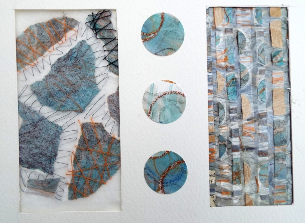
As a collection (without the khadi book), the samples complement one another,

dscf6349

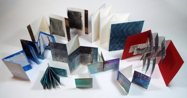
but in this instance, I think it would be cleaner to use one style and change the scale if the final piece is to be a series. So my next step is to work with the back-to-back accordian book, experiment with scale and try the structure without covers. I may try the tab method from the concertina book to make the accordian book.

Golden A (2010) Making handmade books:100 bindings, structures & forms LARK New York

http://www.annwyndean.com/gallery/


4 Comments

Assignment 5 – A Final Piece – Stage 3 Sample making – Considering colour and collage

Inspired by a colour choice in Assignment 2 when joining with staples,

DSCF5934

a painted, concertina book of Sophie Munns:

dscf6279

collages of Leslie Avon Miller:

dscf6286

and a Developing Sketchbooks day at a local Sixth Form College, ideas around colour, layers and collage were explored.  Papers were marked with wax resist, pencils, crayons, biros, washed with colour, painted with emulsion, scraped into, torn, punched with a cutter, arranged and re-arranged, layered and glued.

More excitement, a visual feast, brush marks, texture, torn edges, text, a stormy palette, the contrast of white and the darker blues and greys, the subtler combination of turquoise, burnt sienna and the soft blues and rusts of separating black Quink ink, so exhilarating!  I tingle with anticipation as the watery inks mingle and pool on the page, revealing the uneven edges of the candle wax resist, or as specks of ink settle into the tiny spaces left between the wax of the crayon, some added mark-making with graphite, charcoal or pencil contrast with sweeping brush marks.

In the following sample, on the left, decorated papers were torn, sandwiched and ironed between thin layers of polyester wadding and hand stitched.  The character of the stitch lines, darker on the surface, with the reverse visible through the gauzy wadding, emulating the curves of the decorated paper on the right.   It was useful to learn the added versatility of ironed wadding, with its translucency here and ability to take printing ink a little further down the page.

dscf6281

Referring back to the ‘windows’ which framed the collage of rubbed papers in the previous post, a sketchbook page was cut and decorated.  On the right, snippets of thread and cut circles were trapped between sellotape, sliced up and reassembled creating a semi-transparent window

dscf6282

which was laid over the previous samples.  The framing really enhances the stitched piece and the gaps in the sellotape trappings create a layer over the the underlying painted paper.

dscf6283

Some of my tissue and brown paper stitch prints were torn and added building the composition by balancing the shapes, colour, texture and pattern until I was happy with the outcome.  It was a liberating and rewarding experience, a textural treat in a some of my favourite colours.

Last weekend, an introduction to screen printing using pre-exposed screens helped me to develop my chosen palette further.

Below left, I have printed with three different screens using torn strips of newsprint paper as masks.  The grounds included indigo dipped khadi paper, canvas, calico, silk, linen washed with water soluble inks and quink. The hand drawn circles and lines echoing my earlier theme and the regular straight lines printed like stitch, complementing some of my stitched prints.

Various coloured fabrics and inks were chosen, some of my bright orange space dyed cotton for its strong contrast to the black cotton.  Hues were mixed from selectasine inks orange for the circles and grey for the cotton to connect the grey linen.

Some of the finer fabrics and newsprint paper were positioned in a considered way under the cloth whilst painting and printing, to take full advantage of the ink and print residue. the newsprint absorbs the ink in such a painterly way, with the printed marks adding a contrasting layer.

Simple straight stitch on card printed onto 9g lens tissue, 21g abaca tissue and newsprint, placed on screen-printed black cotton, the grey hand drawn print on the cloth echoing the hand stitch on the paper prints.

dscf6292

Below, gauze washed with black Quink ink and dilute turquoise Dylon, screen printed with grey hand drawn lines and an orange hand drawn circles paper, offsets the charcoal grey collagraph print with its delicate dotty lines, framed by ink-washed tissue with a torn hole:

dscf6299dscf6298

A favourite combination below of ink washed newsprint paper, painted canvas, its coarse surface intensifying the brush marks, with a thin layer of ironed polyester wadding overlaid, all printed with the straight line screen at different angles with greys and white:

dscf6304

I am absolutely delighted with the results of focused, discerning colour experimentation but rather overwhelmed with the quantity of interesting samples to take forward, when combined with the fine paper prints and slightly baffled as to how to sort the most promising and realise their potential.

Some more considered and detached reflection required…..


4 Comments

Assignment 5 – A Final Piece – Stage 3 Sample-making continued

Having identified that printing stitch onto fine papers and combining techniques is the next step in development, some additional samples were prepared for printing, using hand and machine stitch on paper and fabric.

The earlier print samples were produced by inking the plate, placing the stitching face down on the ink, putting it through the press, removing the inked samples, printing from the imprint on the plate and then placing the inked samples onto a clean plate and running that through the press. (making three prints in total)   This time, the emphasis was on trying something different to produce variety in the marks and values.

Whilst playing, a fine paper was laid over the silk and the inked brayer rolled over the top, similar to a rubbing, but with the brayer – excitement mounted, the results were really striking.  Varying the pressure of the brayer and the quantity of ink produced much more variety in values, increasing the visual texture and making some prints more dynamic and others softer with a clarity of detail down to the weave of the cloth.

dscf6300

Adding this new technique to the mix and encouraged by earlier results with silk, a small french knot sample on a scrap of found dress silk was explored.

dscf6294

I was immediately rewarded by  some interesting ‘holes’ appearing having inked the silk direct from the brayer.

dscf6293

Using the silk as a mask added interest and increased options, the striking contrast of the white void against the printed texture of the brayer print on the paper, the uneven edge of the frayed silk and the potential to fill or leave the hole blank.

This has been a successful exercise as the intention was to produce a greater variety of marks and values and those produced from the scrap of silk were remarkable.  The top two samples below where the stitches appear white are printed from impressions on the brayer, taken off the sample, whereas the bottom is the result of the inked brayer rolling across the tissue, laid on top of the silk.  Close examination will reveal the faint wiggly lines of the previous impression on the brayer. Each print exhibits different qualities of line, value and texture.

dscf6295dscf6296

The top right of the three prints above reproduced the intricate weave of the cloth, also evident in the moodier print at the bottom, whilst the tissue, top left, had a ghost of another stitch on it and more uneven values, adding an energy less obvious in the others.

The expressive machine stitched lines of the following sample on paper produced a clear imprint of thread and needle holes on the dark background contrasting with the more muted hazy white dotty lines of the brayer print bottom right.

dscf6297

At this stage, I had a growing collection of interesting prints on various papers, ideas about holes/uneven circles and combining prints by collage or layering.   A vague thought about an artists’ book, concertina? with cut holes?

Giving time to let some of the ideas settle and germinate, I decided to explore colour next.


1 Comment

Assignment 5 – A Final Piece – Stage 3 Sample-making

I was excited to begin hand stitch samples to print with and was soon enthused with the results of some rubbings taken to explore the potential of the stitched marks.

Starting with chain stitch, which was deliberately loose and unconventional for a more expressive outcome, I was encouraged by the potential from a few small lines of quite uninspiring stitch.

In this first rubbing on some 160gsm cartridge paper, the seed pod-like rubbings of large

dscf6252


loose chain stitch in the bottom left were particularly appealing, but once a variety of papers were tested , there was no holding back.  I found that fine papers give beautifully, delicate, detailed rubbings. Printed 9g lens tissue, tea bag paper and chappra tissue melt into the page when adhered with acrylic wax or soft matte gel.

dscf6253

Soft gloss gel works well too, but the matt finish is more appealing in this context, somehow enhancing the delicacy of the stitch and thread and residue of graphite.  HB graphite sticks gave a crisper, cleaner rubbing than the softer 2B stick, but a combination of hardness & softness increased the variety of marks. Rubbing, non-dominant hand drawing, stitching onto tracing paper and layering the results also has potential,

as does rubbing, adding stitch and a watersoluble ink wash. The loosely stitched black linen acted as a mask to the wash, creating faint white stitch marks, both the stitch and white outline contrast with the different values of graphite.  There is also an appeal in the simplicity of sticking to the one stitch, echoing the line and the limited palette.

dscf6258

Different scraps of paper and fabric were stitched with a variety of threads and as mentioned earlier I got quite carried away in the excitement and produced lots of small samples which were then collaged with Golden soft gel (gloss).

dscf6261

The results were inspiring, but I could see that some areas worked better than others and cut some windows in my sketchbook to frame the more successful combinations.

dscf6259

The stitch samples were small and included french knots, straight, herringbone and cross stitch on paper, fabric and nylon netting and were rubbed from all directions on a variety of papers, repeating and overlaying the impressions using graphite, white oil and soft pastel.  The greys, brown’s and blacks with a touch of blue and spot of orange were pleasing and the marks expressive, making me feel quite emotional.  The detail achieved with rubbing was intoxicating,. The rubbing, and hopefully the printing, reveals the back of the stitch as well as the top which adds to the expression.  Using double thread on the french knots produced lovely marks, bottom right above.  The backstitch created more graphic diamond like shapes contrasting with the soft rounded chain stitch and the looser crooked crosses.  The clean line of the waxed linen thread differs from the visual texture of the hairier linen.  The text of the old book pages has similarities with the nylon mesh which together with the speckled tissue create some harmony.

Returning to the original plan of printing from the stitch samples, rather than rubbing, various papers and techniques were explored:

Combining positive and negative, first and ghost prints, tearing or cutting the edges all added to the interest with numerous possibilities and outcomes from each stitch sample.

dscf6269


I thought about the marks of Cy Twombly, creating a monoprint

dscf6265

then couched some hemp thread onto calico, which acted as a mask on the inked original, with graphic results.  The texture of the calico and multi stranded thread creating a lovely detailed print below.

dscf6264dscf6263

Continuing to explore similar marks, inspired by a piece Emily Barletta’s work

the following was stitched with different threads onto heavy stabliliser with quite an appealing serendipitous or perhaps, subconscious, palette choice.

dscf6222

The print results were delicate but not as successful as hoped.  Part of the appeal of Emily Barletta’s piece were the holes created by the needle piercing the paper and the shapes created by stitching the negative space.  Although evident in the above sample the ‘holes’ and Cy Twombly-esque marks were lost in the print.  The stabiliser absorbed ink and printed an interesting texture but this detracted a little from the delicacy of the printed stitched marks.

dscf6276

Lari Washburn inspired the french knot samples and a machined version later.

French knots on silk produced a lovely watery background, middle below, and a clear print from calico on the left:

dscf6266

Feeling buoyed by my exploration, I need to focus, where can I take this?  Whilst the prints are interesting, they don’t stand alone in the context of a final piece and it was printing onto fine papers, combining print techniques and mark, perhaps layering or offsetting that fuelled the excitement.


4 Comments

Assignment 5 – A final piece – Research

Ann Symes

In my search for prints from stitch, I came across Ann Symes’ Knitting Patterns, which are beautiful, delicate prints in limited palettes and resemble some of my initial trials with stitch, which I will relish developing further and recording later in this assignment.

In addition to the ‘knitting patterns’ I found her collagraphs, prints and graphite drawings captivating, a lovely combination of values, loose marks creating visual and actual texture.

The more I looked at her work, the more I admired, such delicate marks and a wide range of values to aspire to.  There are similarities (although slight) between her tea bowl collection and my vases, which I could develop to increase the values and layers inspired by her work.

In the context of developing my printing skills, her work is inspirational, but I also found much of her other work fascinating.

Ann Symes’ background is in graphic design which she says can still influence work but she is also inspired by her surroundings.

The oak and beech woodland that surrounds my home offers an endless source of inspiration through its textures, patterns, sounds, scents, shifting light and shadow, the opening and closing sequences of the seasons, the elements, decay and renewal, small details.  Rather than using specific subject matter I prefer the environment to be a subconscious influence.

Ann Symes 2014

I was also interested to read that, as we have been practicing throughout this course, her

“work evolves as a result of experimenting with different materials and techniques which leads to unexpected discoveries and a resonance”.

I assume her ‘resonance’ is the feeling of excitement when things come together as she states that

“when that stage is reached I can explore and develop it further”.

Leslie Avon Miller paints, draws, collages and makes artists’ books.  I am attracted to the looseness of the marks, the use of negative space, the simple palette, the repetition of marks and her book-making.  She says on her blog, that her work is “a means to honour the world around her”.  She uses collage to record her experiences and also states that

The compulsion for creating collage comes from experiencing life as beautifully wild, poignant, and fleeting. The process of creating collage clears space and light for experiencing the moments.

Sophie Munns is an australian painter who studied Fine Art and has since undertaken a number of artists’ residences at botanical gardens and research in ethnobotany and biocultural diversity. Her research informs her work in which she often abstracts the line and shape of seeds and creates strong repetitive patterns selecting three or four colours for the design.

Once I started to explore hand stitch for print, I was enthused by the patterns and textures achieved with rubbing, so investigated frottage and was particularly impressed by the work of Max Ernst, especially some of the marks which appeared similar to stitch.

Having created lots of rubbing samples and finding myself collaging them together,

dscf6261

I sought an artist who collaged similarly printed and weights of paper and was delighted to find Eva Isaksen’s printed and layered papers, with likeness in mark and the colour palette, I was beginning to explore.

Eva’s work is also inspired by her surroundings:

My work has always been inspired by nature: organic forms, cycles, seasons, land, water, sky, order, rhythm, repetition, growth, life, regeneration. The thin papers, which I print on, draw on, cut up, mix, are layered endlessly on the canvas. My work is about color, line, material, form, and space and about art as a process that always changes and grows.

I have such a fascination with the thin papers I have printed on using different techniques, together with the rubbings, that I am keen to find a way to use and layer them and will draw inspiration from all the artists I have researched in this section.

In my initial experimentation I was also excited by the ‘hole’ remaining having inked a small stitched sample for printing:

dscf6293

and was reminded of an instructional video on youtube uploaded by artist, Gerda Lipski, where she demonstrated monoprinting with a gelatine plate using a mask to create a similar ‘hole’ and produces beautifully textural prints with some subtle colour mixing.

https://about.me/sophie_munns

http://www.annsymes-artist.co.uk (accessed 4.11.16 & 9.11.16)

http://www.evaisaksen.com/

http://suminagashi.com/overview/ (accessed 9.11.16)

http://texturesshapescolor.blogspot.co.uk/

http://texturesshapescolor.blogspot.co.uk/p/artist-books.html

http://texturesshapescolor.blogspot.co.uk/p/collage.html

http://texturesshapescolor.blogspot.co.uk/p/paintings.html


Leave a comment

Assignment 5 – A final piece – Coursework Review

As instructed, the course work was carefully reviewed to identify ideas or techniques found particularly stimulating

Assignment 1 – Folding & Crumpling

Wax resist & black acrylic

DSCF5300

Why?  The visual texture created by black acrylic settling into the gaps in the wax crayon marks.   The loose, quick marks are energetic, complementary colours of orange and blue, with the addition of yellow are bold and the traces of white from original paper colour add to the visual texture.

Charcoal and graphite on textured paper

DSCF4969

Why? The achromatic colour scheme, visual texture and slight metallic sheen of the graphite.  The softness and fluidity of charcoal and graphite to draw with.

Drawing by scraping into wet acrylic paint

Why? The smooth, soft path of the tool drawing into the wet paint is freeing and expressive.

Looking into the centre of linear crumpled tissue

DSCF5048

Why? Actual and visual texture and the shadows in the centre draw the eye in.

Cutting holes and adding a light source, static or moving to create shadows

Why?  The soft patterns differing in value, created in light and shadow and the ability to manipulate them by moving the light source.

Assignment 2 – Joining & Wrapping

Natural wrapped pieces in the style of Tim Johnson

DSCF5737

Why? The simple palette, the natural texture and matt finish, curves and line of the collected matter, the tactility of the various tying materials, linen, silk noil, cotton, jute thread, dry grasses and plant stuff.  The peaceful feeling working with natural materials causes.

Wrapped Jugs

DSCF5772

Why? The contrasting texture of the wrapping material and the shiny ceramic of the jug together with the shapes created by the placement and line of the thread.

Assignment 2 – Joining & Wrapping

Pot coiling

Why? Tactile texture, quirky, characterful shapes, rhythmic, slow stitch making, palette of burgundy, rust and white, re-use of materials.  Once I had grasped the method in each case, these pots were a delight to make and hold, small, tactile, the stitch and materials an enjoyable experience.

Needle felting open weave fabrics

DSCF5576

Why? Texture, the tiny burgundy loops in the above sample, the soft melding of fabrics achievable with needle felting.

Loose handstitch in joining

DSCF5388

Why? Characterful, textural, pleasure to stitch, lovely contrast of black linen thread against wool.

Beeswax

Why? Produces beautiful translucent quality of fine paper, enhances marks.  Waxed linen scrim, emphasises texture, captures frayed edges, gives 3d potential to fabrics.

Using soluble fabric/film to enable free-machining of dried hydrangea petals

Why? Pleasure of working with natural materials, fragility of dried petals, beautiful veins especially when photographed against the light.

Assignment 3 – Molding & Casting

Creating texture with molding paste, colouring with sprayed ink and Sennelier oil pastels

Why? Fine texture captured with paste, lustrous colour. Sennelier oil pastels, deliciously soft and creamy glide over the surface and blend with fingertips.  Speckled ink adding to visual texture.

Casting paper pulp

DSCF5971

Why?  home-made paper, warm, tactile to the touch.  Captured subtle undulating curves of cotton scrim fibres and folds well, slight lustre from graphite.

Casting from Paperclay

Why? So versatile, clay easy to use and warm and light to the touch when green (unfired) but potential maximised with firing, only possible with kiln.  Using paper clay slip, beautifully delicate, fragile casting and even monoprinting possible.

Alginate & plaster of paris

IMG_3622

Why? Amazed by quality of texture captured.  Alginate easy to use with quick results.  The pleasure was from achieving such pleasing results from unfamiliar materials, rather than using the materials.


Casting in plaster from stitched bags and soluble film


Why?  I’m finding it difficult to interpret my feelings, they are complex and need unravelling.  It was very satisfying to control the casting material with interesting results, offering potential for further development, but I was more excited by the stitching element and soluble fabrics than the casting materials. The pleasure was the satisfaction of using stitch and being innovative, the samples laid out to entice me into further development are less exciting.  Is this something I need to try again to determine how I feel?

My inclination is that the methods adopted have the potential to produce exciting work, but can I engage myself in the process?

The artex plaster and linen scrim produced great texture, the gathered stitch in the linen scrim bag added interest.  Using the bag with the seams on the outside produced a neater sample.

The orange net sewn to the soluble film created a fabulous texture as the film dissolved, leaving the white machine stitch on the surface and ‘gathers’ in the plaster.

The cast from the stitched plastic envelope was so cushion like, it was immensely satisfying.  An added bonus was the delicate scalloped edge to the ‘stitched’ holes.

Assignment 4 – Mono and collatype printing

Mark making into the ink on the print plate

Why? Loosely drawn marks are so appealing, soft or sharp, fine or chunky, energetic or relaxing, such a fluid way of working by scraping into the wet ink and printed by hand or enriched by the use of a press.

Back drawing

Why? The quality of the line is gorgeous, fuzzy, textural, characterful.

Printing with finish dishwasher liquid as a discharge agent onto corduroy

dscf6187

DIFFICULTY – product appears to have been discontinued – experiment with Finish Liquid gel to see if similar results can be obtained.

Why do I like this?  The marks are delicately textured and ghostly, enhanced by the addition of tiny stitches in a soft palette.

Monoprinting with masks (1)

DSCF6299

Why?  The use of the blue and orange complementary colour is effective, the gradation of the darker orange to to a lighter shade as it travels up the page, the texture of the orange created with the roller.  The speckles created with brush thinners, the slightly offset printing of the vase creating the white outline.  The central positioning and cropping of the image.

Monoprinting with masks (2)

DSCF6023

Why? The palette, the subtle nature of the marks on the tissue paper print on the right and the speckles created by white spirit allowing the background colour through the black on the left.

Collatype printing 

Why? Fabulous detail achieved with good quality ink, paper and press, vibrant, deep colours, some embossing, 3d effect.

Layers and blocks of colour – mono and collatype hand print, roller counterprinting

dscf6053

Why? Energetic mark making, lots of visual texture, effective layering, complementary orange and blue with addition of yellow, striking use of colour.  White negative space of paper offsetting print well, giving an airy, ‘less is more’ impression.

Printing from stitched materials

Why? huge potential for mark making with hand and machine stitch on numerous materials.  Loose, energetic marks, variety of values, the thread from the back of the hand stitch adds to the character of the marks.   Bottom left blue/black grey moody atmospheric palette.  Added dimension when printed onto different cloth, bottom left loose weave cotton.

Stitch & print with thermogauze

Why? Leaving a little of the Thermogauze stabilizer behind creates additional loose weave texture.  Simple palette, green, black & white, striking effect.

Summary

Careful, detached reflection has identified some common preferences and stimulating techniques.

  • working with a limited palette – subtle or complementary
  • loose expressive mark making
  • delicate lightweight papers, detailed visual texture
  • working with natural materials is peaceful
  • print – both mono & collatype, by hand or press with inexpensive or high quality ink
  • stitch – for print, to enhance print, pot coiling

However, the detailed review has also identified many different techniques which could easily distract, so it is important to be discerning.  What is really interesting and how could it be developed to demonstrate good technical and visual skills, creativity, taking risks with imaginative and successful outcomes?

1. Cast, stitched bags & soluble materials could be exciting, exploring how different approaches to stitched solubles will react with different casting materials.

2. Printing with stitch – ideas are flooding into my mind, printing onto fine papers, colour washing the paper first, waxing it after.  Layering papers.  Printing from hand stitch, couching, machine stitch, natural threads vs synthetics, stitch on paper, card, silk, netting.  I feel driven and excited and can’t stop stitching little samples and printing them, taking rubbings, collaging …..

I have felt torn here, I can see potential in the outcome of casting from stitched bags, but the inclination to explore is slight, I would have to make myself whereas I can’t stop myself printing and stitching.   So, I am going with my gut reaction to develop printing with stitch, endeavouring to be imaginative and take risks.